
Selecting and Creating Displays
The following sections describe how to design the application user interface:
n Selecting and Creating Displays
Selecting and Creating Displays
In Action.NET the main window of the application screen is defined by an object called Layout. A Layout defines the size of the application window and the basic arrangement of display components (Screens and parts of Screens) in the real-time application. See Creating Layouts.
Displays are components of the application that serve as the interface between the user and the monitored process. Each Screen can be formed by several static or dynamic parts (or screens). A screen may contain various display and command elements, including controls, data display areas, static areas, and other objects. These components or screens can be static, that is, they are always displayed, such as a menu bar, toolbar or status bar. The components can also be changed dynamically, depending on what the user clicks or selects.
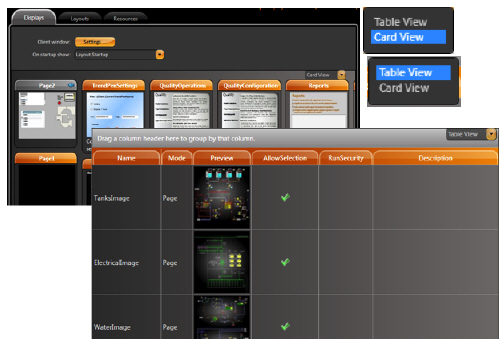
To select displays:
1. Go to Edit > Displays > Displays.
2. Select CardView or TableView, on right top of DataGrid
3. See the display list of available displays appear.
|
Column |
Description |
|---|---|
|
Name |
Screen name configured when creating the screen in the Draw environment. You can rename the screen simply by rewriting the new name on the current text. |
|
Mode |
Read-only. Configured in Draw. |
|
Preview |
Read-only. Shows a thumbnail of the display. |
|
AllowSelection |
Select to allow users to select the display from the PageSelector. |
|
EditSecurity |
Select which types of users have access to edit this display. |
|
RunSecurity |
Select which types of users have access to this display at runtime. |
|
Description |
Enter a description for this display. |
4. Other columns, not included in the table above, refer to the dimensions of the screen. In this table these attributes are in read-only mode. They can be changed in the Draw environment described below.
In order to edit a display, select the row with the display in datagrid, tab Display, and press the DRAW button.
 When you are in the Drawing environment you can also change displays using the Displays ComboBox on the top toolbar. This toolbar, shown below is detailed by next itens.
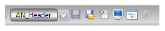
n The list box on the left shows the name of the screen currently loaded on the desktop. Opening this box (click the arrow) the list with all the screens in the project appears. Choosing one in the list, it will be loaded in the Drawing area and will become the current screen for editing.
n The floppy disk icon is used to request changes saved;
n The icon with the floppy disk and the figure opening the tab is to request to save the screen with another name (save as).
n The icon with the + sign should be used to create a new screen empty, and close the screen until now loaded, saving it. Also will appear a window asking for the name to be given to the new screen.
n The symbol with the Video Monitor allows you to show a preview of the screen to see how current screen will look in real time.
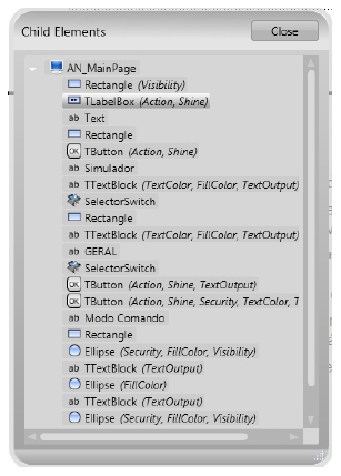
n The icon with the image of a data window, when pressed, makes a window appear with the list of all objects on the screen. Clicking on each of the listed objects, selects the object on the screen. See next figure.
n The last icon is to close the current screen without saving the last changes.
To create a new display
1. Go to Draw > Drawing.
2. Click  Close Display and Create New One.
n If you do not see this button in the toolbar, make your window wider.
n The New Display window displays.
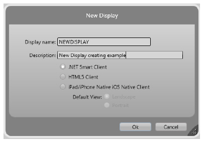
3. Enter or select information, as needed.
|
Column |
Description |
|---|---|
|
Display Name |
Enter a name for the display. |
|
Description |
Enter a description for the display. |
|
.NET Smart Client |
Select this option for screens to be displayed normally on Action.NET clients |
|
HTML5 Client |
Select this screen to work in the HTML5 standard. |
|
iPad/iPhone iOS Target |
Note: If you plan to use this display for iPad and iPhone users, be sure to select this option when you create the display. You cannot change it later. l Select to be able to use this display with iPads and iPhones. When you select this option, display settings in other parts of the Draw area only show options that are applicable to both Windows and iPads/iPhones. l Select the default view for iPad and iPhone users: l Landscape l Portrait |
4. Click OK, to close this window.

If the display is for use with an iPad or iPhone, you must select the iPad/iPhone iOS Target option when you first create the display. You cannot change this setting later.
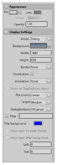
On the left side of the main window there is an area for detailing screen attributes, with two parts: Appearance and DisplaySettings.
Appearance parameters define the "brush" style used when drawing on-screen objects, including colors. By clicking the fill option you can define Colors, gradients or objects to fill a graphic figure.
The parameters in the DisplaySettings define the attributes of the screen. The screens can be configured as PopUps, Dialogs, or Normal Screens. The dimensions of the screen when being created follow what is defined in Info> Settings section.
Like any graphic object, Screens can have different colors and patterns, borders, titles, and more.
A special feature is to specify an animation transition to use when switching from one screen to another in a way similar to that used in PowerPoint presentations.
If you have selected the iPad / iPhone iOS screen option, when you created the view, not all DisplaySettings are available.
To Display properties definition
1. Enter or select information, as needed
|
Column |
Description |
|---|---|
|
Mode |
Select the type of display you want to create: l Page—Default. Opening a page automatically closes the last page on the current layout and displays in the area last in the list on Displays > Layouts page. Only pages display in the layout. l Popup—A popup opens on the top of all other displays. When you open a new page, by default, all popup displays are closed. Controls on other displays are available. l Dialog—A dialog opens as a modal dialog, which disables the controls on all other open displays until you close the dialog. Clicking OK executes the OnOK method on the display CodeBehind. |
|
Background |
Select the background color for the display. |
|
Width |
Enter the width of the display, in WPF units (device-independent pixels). Be sure to take into account the size of the layout. |
|
Height |
Enter the width of the display, in WPF units (device-independent pixels). Be sure to take into account the size of the layout. |
|
Border |
Select the type of border. |
|
CloseButton |
Select to display Close button. Available only for Popups and Dialogs. |
|
Animation |
Select the type of animation to use when displaying this display. |
|
Show on PageSelector Object |
Select to include this display in the page selector that lets users go directly to a different display in the application. |
|
iPad/iPhone iOS target |
Read-only. Shows whether you selected the iPad/iPhone iOS Target option when you created the display. |
|
Placement |
Select where on the layout you want to place the display. Available only for Popups and Dialogs. |
|
Target |
Select whether the display appears relative to the mouse position or relative to whole window. Available only for Popups and Dialogs. |
|
DialogButtons |
Select the buttons you want on the dialog. Available only for Dialogs. |
|
Title |
Enter a title that appears at the top the display. |
|
Title Background |
Select a color for the title background. |
|
Stays Open on Page Change |
Leave the popup window open when the user clicks something that opens a different display. Available only for Popups. |
|
Stays Open After Losing Focus |
Leave the popup window open when the user clicks a different display. Available only for Popups. |
|
Left |
Enter how far from the left of the layout the display should appear, in WPF units (device-independent pixels). Available only for Canvas layouts. |
|
Top |
Enter how far from the top of the layout the display should appear, in WPF units (device-independent pixels). Available only for Canvas layouts. |
2. Use the drawing tools to create the display.
n Select a button in the vertical toolbar. Place the cursor on the display area, then click and hold the left mouse button while dragging the cursor across the display area.
n To see a menu of options, right-click the drawing object. The context menu provides actions that are specific to the selected object.
n To select multiple objects, press Shift + left mouse-click on each object.

When selecting multiple objects, the last object selected is the “master,” whose properties are shown on the left. If you then align the objects, the alignment is based on the master. If you change other properties, the properties are changed for all selected objects.
n The horizontal toolbar (at the bottom of the Drawing tab) contains buttons to group, combine, align, and lock the selected objects.
n For more information about the drawing tools, see Designer Drawing Tools.
3. Click Save Display.
A layout defines the size of the application window and the basic arrangement of display components in the runtime application. Be sure to plan how you want to use displays. For example, consider whether you want a menu bar, toolbar, or other elements to always display at the top of application window.
You may need only one layout to handle the information in the application. Use tab Layouts on Draw environment to layouts settings.
The last screen listed in Layout tab datagrid is the only screen that is replaced when you change the screen. For example, new projects include a default layout called Startup. See in the figure that there are two other screens, or components, in this Layout: AN_Header (a toolbar) and AN_Footer (a footer). The AN_MainPage screen listed in the last row of the DataGrid is the area that, by default, will be changed when you request the application to open another screen.
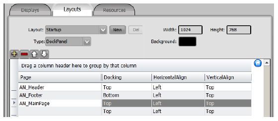
In figure the buttons, above DataGrid on the left in toolbar, are used, respectively, for:
n Add new line and describe screen position (+)
n Remove selected line (-)
n Move up the selected line (^)
n Move down the selected line (V).
To create a layout:
1. Go to Edit > Displays > Layouts.
2. Click New. Will display the window Create new Layout, shown bellow.
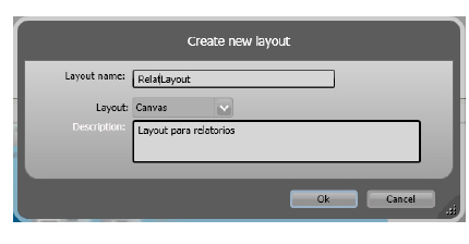
3. Enter or select information, as needed.
|
Column |
Description |
|---|---|
|
Layout name |
Enter a name for the layout. |
|
Layout |
Select the layout type: l DockPanel—Select to position displays relative to the layout and other displays. l Canvas—Select to position displays in an absolute position by entering the position in WPF units (device-independent pixels). |
|
Description |
Enter a description of this layout. |
4. Click OK. The Create New Window will close.
5. At the top right of the Layouts tab, enter or select information, as needed.
|
Column |
Description |
|---|---|
|
Width |
Enter a name for the layout. |
|
Height |
Enter the height, in WPF units (device-independent pixels), of the layout. This is the height of the runtime application. Will come filled with Info>settings for Display Size default. |
|
Background |
Enter the width, in WPF units (device-independent pixels), of the layout. This is the width of the runtime application.Will come filled with Info>settings for Display Size default.
|
6. Click  Add Row to add a row for a display.
n The displays you add here are the first displays the layout uses.
7. Enter or select information, as needed.
|
Column |
Description |
|---|---|
|
Page |
Select a display you want to include in the layout. Only page displays are available for use in a layout. |
|
Docking |
Select the docking location for this display: l Left l Top l Right l Bottom |
|
HorizontalAlign |
Select the horizontal alignment for this layout: l Left l Center l Right |
|
VerticalAlign |
Select the vertical alignment for this layout: l Top l Center l Bottom |
The Startup Layout, shown in the DataGrid above, comes with Action.NET Default project. See following information on each of these areas:
It is a schematic defining a header screen, a footer and the main screen in the central part of the monitor. To be shown as a single screen, we should define a Layout as shown below in the Startup layout:
n AN_Header: is the screen header set at the top left. As the layout dimension is 1024 x 768, for header occupy the entire upper horizontal part of the layout should have a width of 1024. In the case of this application, its dimension is 1024 x 60.
n AN_Footer: is the footer of the screen, set at the bottom of the screen to the left. Similarly to the header, it should have a length of 1024 to occupy the entire bottom of the screen. In case of this application its dimension is 1024 x 45.
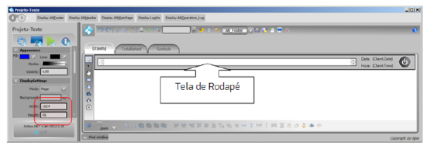
n AN_MainPage: will be the core of the layout with the various process screens that will be used. In this application, considering that the header has height (Height) of 60 points and the baseboard 45, the cradle screens should have a vertical dimension of 768 - 60 - 45 = 663. Thus, all the screens inserted in the core of this layout should have the dimension of 1024 x 663.
When there is more than one layout in a project, before opening a screen one should open its layout and the screen will always be placed at the last level of the layout (in the case above level 2)..
n As an example, below is a script opening a layout and a screen:
@Layout.AN_NoFilterReports.Open();
@Display.AN_HistoricEventsSummary.Open();
The View area settings control how the application should display the screens on the client computer monitors, that is, how they should use the Action.NET visualization modules.
For this configuration there are buttons and controls at the top of the Display environment, shown in the figure below.
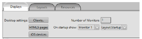
These settings are different for normal MS-Windows clients than those required for customers using iOS from Apple tablets and iPhones, or in HTML5 format. The following sections detail these settings.

MS-Windows Desktop Client Settings
To configure the desktop client settings:
1. Go to Edit > Displays > Displays.
2. If needed, configure the Desktop Settings for Windows client by clicking Clients.
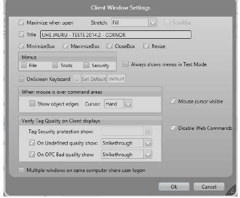
3. Enter or select information, as needed, and click OK.
|
Column |
Description |
|---|---|
|
Maximize When Open |
Select to maximize the client window to fit the monitor. |
|
Stretch |
Select how the layout stretches when clients use the application: l None—Layout does not resize; it displays the exact size you configured for the layout. We recommend selecting the Scrollbar option. l Fill—Layout resizes to completely fill the available space on the client’s monitor., without regard to the layout’s aspect ratio. l Uniform—Layout resizes proportionally to the client’s monitor size, maintaining the layout’s aspect ratio. l UniformToFill—Layout resizes to both maintain the aspect ratio and to completely fill the available space on the client’s monitor. This can result in cutting off some parts of the layout. |
|
Scrollbar |
Select to have a scrollbar display in the client window. |
|
Title |
Enter a title for the client window. |
|
MinimizeBox |
Select to display the standard minimize button. |
|
MaximizeBox |
Select to display the standard maximize button. |
|
CloseBox |
Select to display the standard close button. |
|
ResizeBox |
Select to display the standard resize handle. |
|
Menus |
Select which menus display: l File l Tools l Security |
|
Mouse Cursor Visible |
Select for the mouse pointer to be visible. |
|
OnScreen KeyBoard |
Select to display a numeric keypad. |
|
Disable Web Comments |
Select to prohibit application users from sending commands to the PLC. |
|
When Mouse Is Over Command Areas |
Select what displays: l Show object edges— l Cursor—Select the type of cursor. |
|
Verify Tag Quality on Client Displays |
l On undefined quality show—Select option and character to show when PLC determines the data quality is undefined. l On OPC Bad quality show—Select option and character to show when OPC server determines data quality is bad. |
|
Share Logged User at Same Computer |
Users can run multiple instances of the application on the same computer. The user may need to log in as a different user from time to time. Select this option to automatically change the logged in user in all running instances of the application on the same computer. |
4. Enter the Number of Monitors clients will use.
5. Select the monitor and layout to show when the application starts.
If needed, configure settings for iOS client by clicking iOS devices.
To configure the workspace for IOS client :
1. Press IOS Device button. This will display the iOS Native Clients Setting window.
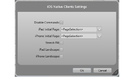
2. Enter or select information, as needed, and click OK.
|
Column |
Description |
|---|---|
|
Disable Commands |
Select to prohibit application users from sending commands to the PLC. |
|
iPad Initial Page |
Select the display that iPad users see when they start the application. |
|
iPhone Initial Page |
Select the display that iPhone users see when they start the application. |
|
Stretch Fill |
Select to resize the application to fill the device screen. |
|
iPad Landscape |
Select to resize the app to appear as landscape on iPads. |
|
iPhone Landscape |
Select to resize the app to appear as landscape on iPhones |
If you are using HTML5-formatted screens, make the settings as well.
To configure the desktop for HTML5 screens:
1. Press the HTML5 button. The HTML5 setup window appears.
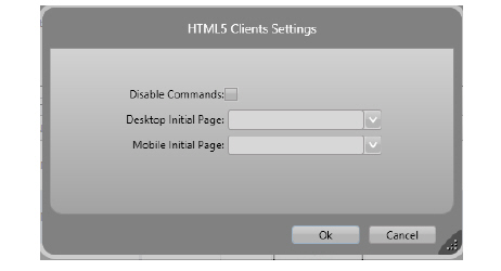
2. Type or select the information as needed, and then click OK.
|
Column |
Description |
|---|---|
|
Disable Commands |
Select to prohibit application users from sending commands to the field |
|
Desktop Initial Page |
Select the Screen that users should see when starting the application on Desktop |
|
Mobile Initial Page |
Select the Screen that users should see when starting the application. on Mobile. |
The Draw desktop provides all the tools for building graphic screens for the application.

To enter this environment, click the Draw icon.
In Action.NET the Draw environment has three tabs:
Drawing where the screens are displayed and can be edited. On the Drawing tab, there is a vertical toolbar on the left side of the work area and a horizontal bar on the bottom of the same area, task oriented on objects within a screen.
CodeBehind for scripting related to the screen. In this tab there is a Source Editor and the texts of prototypes of the procedures that are activated by basic events on screens appear. If necessary these texts must be filled with codes to modify the standard procedure of the screen.
Symbols with the graphic symbol library available in the project. In this grid you can edit symbol attributes. To create a symbol, use the right mouse button on an object on a screen.
Use the CodeBehind tab to define a set of functions connected with a display. You can write code in either standard VB.Net or CSharp. You can also switch between the two. If you change your language selection, the system automatically converts existing code to the selected language.
If you need references to your own assemblies, use Run > Build > References.
CodeBehind functions can be executed when opening or closing, or while the display is open, depending on how you configure the code. You can use CodeBehind to define mouse and input command handling methods to be executed on a specific display.
For Dialog displays, use the built-in DialogOnOK method, which is called when the built-in OK button on the dialog is pressed. If "True" is returned on that method, the dialog is closed; if "False" is returned, the dialog remains open. This method is commonly used to ensure data validation on the dialog (which prompts the user to correct incorrect entries before to closing the dialog).
The Code Behind of the Displays have the following pre-defined methods:
n DisplayOpening()
Executed when display is opening.
n DisplayIsOpen()
Called in a regular intervals while the display is open.
n DisplayClosing()
Executed when display is closing.
n DialogOnOK()
Called when the OK button on a Dialog display is pressed.
Returning 1 allows the dialog to close.
Returning 0 prevents the dialog from closing.
You can add your own .NET variables and methods to this page.
Because the client displays are designed to run on distributed and web environments, we recommend avoiding the use of functions that do not allow partial trust execution or that refer to physical file paths.
The Drawing tab has the following controls to create, format, and configure displays:
n Vertical toolbar—On the left side of the Drawing tab. Use these buttons to draw shapes, add buttons, and create special windows.
n Horizontal toolbar—Across the bottom of the Drawing tab. Use these buttons to group, combine, align, and lock the selected objects.
n Appearance, DisplaySettings, Dynamics and other settings—Below the main menu buttons, these settings vary based on the type of object selected.
|
Button |
Description |
|---|---|
|
|
l Click an object to select it. l CTRL+click to select multiple objects (and object groups), one at a time. Hold down the CTRL key as you click each object. l Shift+click to toggle selected object from among more than one selected objects. l Click in an open area of the display then select a group of elements by highlighting the elements while holding down the left mouse button. l Double-click an object to open the Dynamics Configuration window, which provides settings for dynamic object properties. |
|
|
l Use this tool to select an object inside a group (and modify its properties). Click the object to select it. l You can also add, remove, and modify the points in a Polyline with the Direct Selection Tool: l To move the point select it by clicking the point and holding the left mouse button down. Drag the point to its new position. l Double-click a point to add a new point adjacent to the selected point. l Right-click a point to delete the selected point. |
|
|
Use the Hand Tool to modify the view window by clicking the display background and holding down the left mouse button then shift the display to the desired position. |
|
Geometric objects tools |
Right-click to end use of each tool. To add, modify, and remove points after creating a polygon or polyline, use the Direct Selection Tool. |
|
|
Creates a rectangle object. |
|
|
Creates an ellipse object. |
|
|
Creates a polygon object. |
|
|
Creates a polyline object. |
|
|
Creates a button object. |
|
|
Creates a text output object. |
|
|
Creates a text input/output (I/O) object. To link the text I/O object with a tag, double-click the text I/O object, under the Dynamic configuration window select the TextIO dynamic. |
|
|
Creates a check box object. Right-click this button to access the following tools:
After selecting a tool from this menu, it becomes the default tool for that button in the vertical toolbar. |
|
|
The symbol library includes both built-in and user-defined symbols. |
|
|
Open SimbolFactori application, to get ready to use several vectorial graph symbols |
|
|
Open Images library, to get from it images early inserted in project. |
|
|
Creates a Web Browser object. Right-click this button to access the following other tools, included in this set:
After selecting a tool from this menu, it becomes the default tool for that button in the vertical toolbar. |
|
|
Creates an alarm window. Position the alarm window and double-click to configure the alarm window settings. For more information, see Configuring an Alarm Window. |
|
|
Creates a trend window. Position the trend window and double-click to configure the trend window settings. For more information, see Configuring the Trend Window. |
|
|
Creates a data grid window. Position the data grid window and double-click to configure the data grid window settings. For more information, see Configuring a DataGrid Window. |

|
Button |
Description |
|---|---|
|
|
Grid definition |
|
|
Screen Zoom |
|
|
Group |
|
|
Ungroup |
|
|
Union |
|
|
Intersect |
|
|
Exclude |
|
|
Exclusive-Or |
|
|
AlignLeft |
|
|
AlignHorizontalCenter |
|
|
AlignRight |
|
|
AlignTop |
|
|
AlignVerticalCenter |
|
|
AlignBottom |
|
|
Move To The Front |
|
|
Move To The Back |
|
|
Resize Width |
|
|
Resize Height |
|
|
SpaceEvenlyHorizontal |
|
|
SpaceEvenlyVertical |
|
|
FlipHorizontally |
|
|
Flip vertically |
|
|
Lock control position |
|
|
Unlock control position |
|
|
Turn control visible |
|
|
Turn control not visible |
See in this table the meaning of each button, from left to right.
In DRAW area, on the left side is the configuration panel for display and display properties. The following sections show details about these settings.
n See "UId and Text" on page 182 for the text setting and Identifier.
n To configure the dynamic, see "Dynamics and Animations" on page 182
n To configure controls, see "User Interface Controls" on page 193.
n See "Appearance and Transformation" on page 203 for Appearance.
n See "Changing Multiple Controls" on page 201 for tag-switching operations.
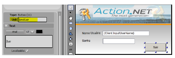
When you create a new object or symbol on the screen, it receives a number that uniquely identifies it: The <Uid>. This Uid can be renamed by any String, which is very useful when it is necessary, for example, to write Script code (CodeBehind) involving the control.
As an example, a Button used in the Login window is displayed. This object had its number changed to cmdSair, to facilitate its understanding within the code, as can be seen in the following figure:
Text is the area where you can specify a caption or title for a control that allows this functionality. You can specify the font, size, and color of the text, in addition to the text itself.
The Localizable option should be checked in case you are using language dictionaries in the project, and you want this text to be changed according to the dictionary.
Dynamics let you configure real-time changes on the object look, position, size, colors, the value the object reflects, user action to take when a user clicks, and more. That dynamic behavior is configured by creating links of the object properties to tags or other project runtime properties.
In some systems, the name “animation” is used to refer to those dynamic runtime changes; in Action.NET we elected to use the term “Dynamic” to make the clear distinction with the WPF animations features; WPF animations also refers to changes the graphics object properties when running the displays, but using timers and other objects status to guide the animation, not the real-time database values.
When you double click on an object, or press the Dynamics button, or select it on the right-click context menu, a list of compatible dynamics that can be applied to the selected object is presented.
Table Lists the available dynamics.
|
Setting |
Description |
|---|---|
|
Action |
Executes action triggered by the user interface:. |
|
Event |
Choose one of the Mouse events. More than one event can be selected for each action. For example: One action for MouseLeftButtonDown and another action for MouseLeftButtonUp. |
|
Action |
Select an action for the given event: l None—No action. l SetValue—Sets the value of the object. l Object—The object that will receive the value. l Value—The value that will be passed to the object. l ToggleValue—Toggles the object value. If the object current value is zero, the value will be 1. If the object current value is different from zero, the value will be 0. l Object—The object that will be toggled. l OpenDisplay—Opens a display. l Display—The name of the display that will be opened. l CloseDisplay—Closes a display. l Display—The name of the display that will be closed. l OpenLayout—Opens a layout. l Layout—The name of the layout that will be opened. l RunScript—Runs a script that is placed in the display CodeBehind tab. Do one of the following: l Enter the new method name and click New. l Select one of the existing methods in the comboBox. l RunExpressions—Runs the given expression. l Expression—Enter the expression. For example: Tag.a + 1, or Tag.a + Tag.b, or Math.Cos(Tag.angle) * Math.PI. l Result (optional)—Enter the tag or the property that will receive the expression value.
|
Run Expressions Examples:
l Sum two values and pass the result to another tag.
Expression—Tag.quantity1 + Tag.quantity2.
Result—Tag.totalQuantity.
l Increment a tag.
Expression—tagCounter + 1.
Result—tagCounter.
l Increment a tag (0 - 10).
Expression—If(tagCounter < 10,tagCounter + 1,0).
Result:—tagCounter.
For more information, see Configuring Expressions.
|
Setting |
Description |
|---|---|
|
Shine |
Changes the object appearance dynamically. |
|
IsMouseOver |
Enter a tag that will receive the OverValue or the NotOverValue. |
|
OverValue |
The IsMouseOver value when the mouse is over the object. |
|
NotOverValue |
The IsMouseOver value when the mouse is not over the object. |
|
Mouse Over Appearance |
The object appearance when the mouse is over it. l Opacity—The object opacity (0 = transparent, 1 = opaque). l Scale—The object size (0.5 = half, 1 = the same size, 1.5 = one and a half, 2 = double size). l OuterGlow—Defines the OuterGlow color, the check box enables or disables it. l TextColor—Defines the text color, the check box enables or disables it. |
|
Mouse Not Over Appearance |
The object appearance when the mouse is Not over it: l Opacity—The object opacity (0 = transparent, 1 = opaque). l Scale—The object size (0.5 = half, 1 = the same size, 1.5 = one and a half, 2 = double size). |
|
Is Selected Appearance |
The object appearance when it is selected: l IsSelected—Defines whether the object is selected. l Opacity—The object opacity (0 = transparent, 1 = opaque). l Scale—The object size (0.5 = half, 1 = the same size, 1.5 = one and a half, 2 = double size). |
|
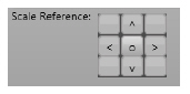
Scale Reference |

O - Center; < Left; ^ Up; > Right; V Down |
|
Setting |
Description |
|---|---|
|
TextIO |
Text input and text output Dynamic. If text is a tag value or a property, it must be between curly brackets. For example: {Tag.analogInt1} |
|
Binding Mode |
Associate an object with a tag: l TwoWay—Input and output allowed. l InputOnly—Only input allowed (the current tag value is not shown, but new values can be entered). l OutputOnly—Only output allowed. |
|
Object or Expression |
Object (input) or Expression (output only) connected with the Text Box. |
|
DesignModeCaption |
The value shown in design mode: l ShowObjectNames—The content of the text field is shown exactly as it is. l ShowPlaceHolders—The characters ### are shown, the number of characters is defined by the MaxLength field. |
|
Input Range |
Defines the numeric range for the entered value. |
|
MaxLength |
Defines the maximum number of characters. |
|
Setting |
Description |
|---|---|
|
|
Opens a hyperlink. |
|
HyperLinkType |
Select the hyperlink type: l http l ftp l file l mailto l telnet |
|
Url |
Set the URL to open. |
|
Setting |
Description |
|---|---|
|
Security |
Set the object runtime permissions:. |
|
Disable |
Enter a tag, a property, or an expression returning a value. Considering the resulted value: l Zero—Object will be enabled. l Greater than zero—Object will be disabled. For more information, see Configuring Expressions. |
|
Verify Permissions |
When selected, only the chosen permission groups can access the object. |
|
Confirm Message |
Shows a confirmation dialog before taking some action: l textBox—Enter the message that will appear in the dialog. l checkBox—Enables or Disables the Confirm Message. |
Fill, Line and Text Color Dynamic
|
Setting |
Description |
|---|---|
|
FillColor |
Changes the object fill color dynamically. |
|
Expression |
the value used for the FillColor dynamic. |
|
Change Color |
l UsingLimits—The resulting color is determined when the value is equal or higher than one of the limits. l AbsoluteValue—The color will be the expression value. The value must be a valid color name or hexadecimal color. For example: "White" or "#FFFFFFFF" Example Limits: 1 - Red 10 - Blue When the value is 0, the object will have its own color (fill color dynamic will not do anything) When the value is 1 to 9, the object will have the red color. When the value is greater than 10, the object will have the blue color. |
|
LineColor |
Changes the object line color dynamically:. |
|
Expression |
the value used for the LineColor dynamic. |
|
Change Color |
l UsingLimits—The resulting color is determined when the value is equal or higher than one of the limits. l AbsoluteValue—The color will be the expression value. The value must be a valid color name or hexadecimal color. For example: "White" or "#FFFFFFFF" Example Limits: 1 - Red 10 - Blue When the value is 0, the object will have its own color (fill color dynamic will not do anything) When the value is 1 to 9, the object will have the red color. When the value is greater than 10, the object will have the blue color. |
|
TextColor |
Changes the object text color dynamically:. |
|
Expression |
the value used for the TextColor dynamic. |
|
Change Color |
l UsingLimits—The resulting color is determined when the value is equal or higher than one of the limits. l AbsoluteValue—The color will be the expression value. The value must be a valid color name or hexadecimal color. For example: "White" or "#FFFFFFFF" Example Limits: 1 - Red 10 - Blue When the value is 0, the object will have its own color (fill color dynamic will not do anything) When the value is 1 to 9, the object will have the red color. When the value is greater than 10, the object will have the blue color. |
|
Setting |
Description |
|---|---|
|
|
Bargraph dynamic. |
|
Expression |
the value used for the bargraph dynamic. |
|
Value Range |
The minimum and maximum values that will correspond to the minimum and maximum fill percentage. |
|
Fill (%) |
The minimum and maximum bargraph fill percentage. |
|
Bar Color |
The bar graph color. |
|
Orientation |
The bar graph orientation: 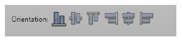
From left to right: to DOWN; horizontal center, to UP; to right; vertical center; to left |
|
Setting |
Description |
|---|---|
|
Visibility |
Changes the object visibility and opacity dynamically. |
|
Visible |
Enter a tag, a property, or an expression returning a value. Considering the resulting value: l Zero - Object will be visible. l Greater than zero - Object will be hidden. For more information, see Configuring Expressions. |
|
Tooltip |
The string that will appear as a tooltip |
|
Opacity |
l ObjectValue—The value used to set the opacity. l Range—The minimum and maximum values that will correspond to the minimum and maximum opacity. l Opacity—The minimum and maximum opacity (0 - invisible, 0.5 - a bit transparent, 1 - opaque). |
|
Setting |
Description |
|---|---|
|
|
Moves the object dynamically. |
|
BindingMode |
l TwoWay—Input moving and output moving. l InputOnly—Input moving only. The object does not move when the object value changes. l OutputOnly—Output moving only. The object does not move with user interaction. |
|
Horizontal Move |
l Expression with the horizontal move reference. l Range—The minimum and maximum values that will correspond to the minimum and maximum horizontal position. l Position—The minimum and maximum horizontal position. |
|
Vertical Move |
l Expression with the vertical move range. l Range—The minimum and maximum values that will correspond to the minimum and maximum vertical position. l Position—The minimum and maximum vertical position. |
|
Setting |
Description |
|---|---|
|
Scale |
Changes the object size dynamically. |
|
Width Scale |
l Expression—the value used for the width scaling. l Range—The minimum and maximum values that will correspond to the minimum and maximum width scale percentage. l Scale (%)—The minimum and maximum width scaling percentage. |
|
Height Scale |
l Expression—the value used for the height scaling. l Range—The minimum and maximum values that will correspond to the minimum and maximum height scale percentage. l Scale (%)—The minimum and maximum height scaling percentage. |
|
Scale Reference: |
O - Center; < Left; ^ Up; > Right; V Down |
|
Setting |
Description |
|---|---|
|
Rotate |
Rotates the object dynamically. |
|
Expression |
the value used for the rotation. |
|
Value Range |
The minimum and maximum values that will correspond to the minimum and maximum angle. For example: 0 to 100 |
|
Angle |
ºThe minimum and maximum rotation angle. For example: 0 to 360 |
|
Center Reference |
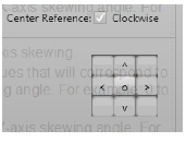
O - Center; < Left; ^ Up; > Right; V Down |
|
Setting |
Description |
|---|---|
|
Skew |
Skews the object dynamically. |
|
X-axis Skew |
l ObjectValue— the value used for the X-axis skewing. l Range—The minimum and maximum values that will correspond to the minimum and maximum X-axis skewing angle. For example: 0 to 100. l Skew (º)— The minimum and maximum X-axis skewing angle. For example: 0 to 180º. |
|
Y axis skew |
l ObjectValue— the value used for the Y-axis skewing. l Range—The minimum and maximum values that will correspond to the minimum and maximum Y-axis skewing angle. For example: 0 to 100. l Skew (º)— The minimum and maximum Y-axis skewing angle. For example: 0 to 180º. |
|
Skew Reference |
O - Center; < Left; ^ Up; > Right; V Down 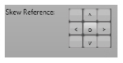
|
|
Setting |
Description |
|---|---|
|
TextOutput |
Text output dynamic. |
|
Expression |
Indicates the text that will be shown in the object. |
|
Localizable |
Indicates whether the text must be translated when the dictionary changes. |
|
DesignModeCaption |
The value shown in design mode: l ShowObjectNames—The content of the text field is shown exactly as it is. l ShowPlaceHolders—The characters ### are shown, the number of characters is defined by the MaxLength field. |
|
MaxLength |
Defines the maximum number of characters. |
n To configure external components WPF (some already available in this product), see Configuring WPF Components
n To configure an alarm window, see Configuring an Alarm Window.
n To configure a trend window, see Configuring the Trend Window.
n To configure a DataGridWindow, see Configuring a DataGrid Window.
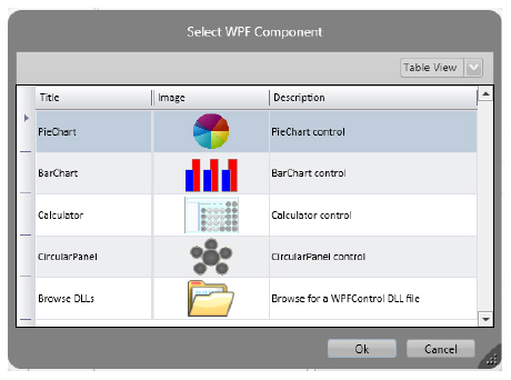
In the vertical toolbar in Edit> Draw, one of the options is the choice of WPF Components, which can be installed for use in the creation of screens.
When you choose the icon with the folder, a window will open showing all the components, which are already distributed with Action.NET. To create an instance of the currently edited screen, simply click (select) the desired component and close the window by clicking the Ok button.
The figure shows this WPF component selection window.
The following sections provide instructions for configuring some WPF components, already distributed wit this product.
n To configure a circular panel, see User Interface Controls.
n To configure a pie chart, see Configuring a PieChart.
n To configure a bar chart, see Configuring a BarChart.
Double-click any Circular Panel object in the display to configure it. Table 15 describes the Circular Panel configuration.
|
Field |
Description |
|---|---|
|
Control Name |
Defines a name for the control, so it can be accessed in the CodeBehind script. See Displays Code Behind. |
|
Columns |
For each value that you want to include, select a section and configure the settings to the right of the list (described below). The panel displays a section for each column. |
|
Image |
Select a resource image to display. |
|
Preview |
Read-only display of selected image. |
Double-click any PieChart object in the display to configure it. Table 16 describes the Pie Chart configuration.
|
Field |
Description |
|---|---|
|
Control Name |
Defines a name for the control, so it can be accessed in the CodeBehind script. See Displays Code Behind. |
|
ChartType |
Select the type of chart. |
|
Data Items |
For each value that you want to include, select a section and configure the settings to the right of the list (described below). The chart displays a section for each data item. |
|
FieldName |
Enter a name for the data item. |
|
LinkedValue |
Enter a tag name as the data source for the data item. |
|
Brush |
Click to select the color for the data item. |
Double-click any BarChart object in the display to configure it. Table 17 describes the Bar Chart configuration.
|
Field |
Description |
|---|---|
|
Control Name |
Defines a name for the control, so it can be accessed in the CodeBehind script. See Displays Code Behind. |
|
Type |
Select the type of chart. |
|
Data Source |
Enter the dataset table or query to use for the chart. |
|
Grid Lines |
Click to select the color for the grid lines. |
|
Window |
Click to select the color for the window background. |
|
Labels |
Click to select the color for the labels. |
|
Show Horizontal Labels 45° |
Select to angle the labels below each bar at 45°. |
|
Show value over bar |
Select to display the bar value above the bar. |
|
Data Items |
For each column in the data source that you want to include, select a bar and configure the settings to the right of the list (described below). The chart displays a bar for each row. |
|
FieldValue |
Name of the column in the database. |
|
Min. |
Enter a tag to define the minimum value. |
|
Max. |
Enter a tag to define the maximum value. |
|
Brush |
Click to select the color for the data item. |
Double-click any Alarm window object in the display to configure it. Table 18 describes the Alarm window configuration.
|
Field |
Description |
|---|---|
|
Control Name |
Defines a name for the control, so it can be accessed in the CodeBehind script. See Displays Code Behind. |
|
MaxLines |
Maximum number of lines to display in the window. |
|
List |
Select the type of alarms to display in the window: l OnlineAlarms—Displays only active alarms. Alarms only display while the alarm is in the alarm state. l AlarmHistory—Displays only past alarms. l Events—Displays only the SystemEvents (Edit > Alarms > Groups). l AlarmHistory+Events—Displays past alarms and SystemEvents. |
|
Merge Hi and HiHi Lines |
Combines alarms configured as Hi and HiHi into a single row. |
|
History Interval/To |
Enter the start and end dates for the alarms. |
|
Show Column Titles |
Select to display the column titles. |
|
Ack by Page |
Enter a tag name, which when triggered, acknowledges the alarms in the alarm window. |
|
Show Group Control, Label |
Enter text to display above the column titles. |
|
AllowSort |
Select to let users sort the data by column. |
|
Allow Column Reorder |
Select to let users change the order of the columns. |
|
Filter |
Enter SQL statement to limit the alarms displayed. |
|
Refresh |
Enter a tag name that will trigger a refresh of the alarm data. |
|
Display Millisecond |
Select to include milliseconds in the alarm time. |
|
Ack Selected Line |
Configure settings for acknowledging an alarm. |
|
Columns |
For each column in the list, select the column and configure the settings to the right of the list (described below). |
|
Visible |
Select for column to display in the alarm window. |
|
Allow Filter |
Select to let users filter the column. |
|
Show in Column Chooser |
Select to include the column in the column chooser, which lets users select the columns to display. |
|
Title |
Enter the text for the column title. |
|
Width |
Enter the initial column width, in WPF units (device-independent pixels). |
|
Sort |
Select how to initially sort the column. |
The information in this item refers to a new Trend Graphical object made available after the an-2014.2 version.
This graphical trend object is chosen with the symbol

Double-click a Trend Window object on the screen to configure it. Next table describes the configuration of the trend window.
|
Field |
Description |
|
Control Name |
Define a name for the control, so that it can be accessed in the CodeBehind script. |
|
Bind to Tag |
Choose a property of an object in the button so that the configuration of this trend object is saved in this property. |
|
Bind Pens to tag |
Choose in the button a property of an object in which the values of the feathers will be saved.
|
|
Orientation |
You can choose the orientation of the graph: Horizontal; Vertical from top to bottom or Vertical from bottom to top.. |
|
Window |
Sets the background color of the trend control. . |
|
Labels |
Define the color of trend control labels
|
|
Grid Lines |
Define the color of graph gridlines |
|
Grid Lines Stroke |
Sets the grid lines format, full, dashed, etc. and its thickness. . |
|
Cursor Settings |
Cursor Settings Press the "Settings" button to set up to two cursors for the graph. One primary and one secondary. For each one of them can be defined: if enabled or not, the color and shape of the line, a legend (Tooltip), and whether or not to display with the cursor the current values of the quantities in x and y. |
|
Mouse Actions |
Check this option if you want to receive notifications according to the mouse actions. |
|
Marker tooltips |
Check this option if you want tooltips to be displayed on the point marks. |
|
Y Axis |
|
|
Y scale for each pen |
Check this option if you want to assign scales of your own for each penalty. In this case the "Range" will be set in the abbreviated feather table.
|
|
Y Range |
Sets the minimum and maximum values for the Y axis.
|
|
Labels |
Sets the amount of horizontal grid lines. |
|
Format |
The format of the Y-axis values. For valid numeric formats, see "Tag Formats" on page 96. For example, N1 (number with one decimal place). |
|
Stack Y scales |
Select this option so that the scales appear vertically one above the other. If you did not check the scales appeared side by side. |
|
Merge similar Y scales |
Check that if the scales are similar just show one of them. |
|
Legend |
Sets the position of the pen legend frame in trend control.
|
|
|
|
|
X Axis |
|
|
Duration |
Sets the time interval of the X-axis. Choose this option if the X axis is time |
|
XY Chart |
Choose this option if the X-axis is not a time-out. In this case set the minimum and maximum values for the X axis. |
|
Labels |
Sets the amount of vertical grid lines |
|
Format |
The X-axis format is defined by two fields: first-line format and second-line format. This is especially useful for defining tags for tags that require two lines of information. For valid date and time formats, see "Tag Formats" on page 96. For example, t (time) for the format of the first line, d (short date) for the second line format. |
|
Navigation controls |
Check this option if you want the icons of the graph navigation control to appear below the X axis: Zoom in, Zoom out, scroll left, scroll right, reset values and fill all until then. 
|
|
Pens |
Pens The buttons allow you to add a new pen, delete a pen and still change the order of the pen lines. For each row the following data must be defined. 
|
|
TagName |
Sets the tag that will provide the value for the penalty
|
|
PenSettings |
Clicking on the cell appears window for color definitions and line format, if fill below the line, and symbols on the points. |
|
MinValue |
Minimal linear scale value for tag value, according to Y-axis range. |
|
MaxValue |
Maximum linear scale value for tag value, according to X axis range. |
|
Pen Label |
Label with the title for the pen.
|
|
Auto |
By marking this cell, the range will be automatic, according to the displayed values. |
Using Y Axis Scaling
Considering:
Y-axis Min = 0;
Y-axis Max = 100;
The trend control allows many pens to be displayed together. When your pens do not have the same range, you can use the tips below to fit your data in the same chart, for better visualization:
n If a pen has a lower range, 0 to 1 for example, you can set the Max property of the pen to 1, so when the real tag value is 1, the value 100 will be displayed in the chart. (100/1 scale).
n If a pen has a higher range, 0 to 1000 for example, you can set the Max property of the pen to 1000, so when the real tag value is 1000, the value 100 will be displayed in the chart. (1/10 scale).
Double-click any DataGrid window object in the display to configure it. Table 19 describes the Data Grid window configuration. Critical fields that you must configure are shown with an *.
|
Field |
Description |
|---|---|
|
Control Name |
Defines a name for the control, so it can be accessed in the code-behind script. See Displays Code Behind. |
|
Data Source |
Enter the dataset table or query to use for the window. |
|
SelectedValues |
Enter a string tag or array tag to receive the contents of the selected row. |
|
SelectedIndex |
Enter a tag to receive the number of the currently selected row. Row numbering starts with 0. |
|
LinesCount |
Select a tag to receive the number of lines in the window. |
|
Theme |
Select the theme for the window. |
|
BindindMode |
Select the binding mode to use. See http://msdn.microsoft.com/en-us/library/system.windows.data.bindingmode.aspx. |
|
AllowInsert |
Select to let users add rows. |
|
Show Group Control, Label |
Enter text to display above the column titles. |
|
Show Column Titles |
Select to display column titles. |
|
AllowSort |
Select to let users sort the data by column. |
|
Auto Create Column |
l Select to have the system automatically include all table or query columns in the window. If selected, you do not have to configure the columns below. To customize specific columns, add the column to the column list and configure the settings to the right (described below). l Deselect to manually configure each column that you want to include using the Columns list and settings to the right (described below). |
|
Filter |
Enter SQL statement to limit the data displayed. |
|
Refresh |
Enter a tag name that will trigger a refresh of the data. |
|
Columns |
For each column you want to customize or include manually, add the column and configure the settings to the right of the list (described below). |
|
Visible |
Select for column to display in the data grid window. |
|
Editable |
Select to let users edit the column. |
|
Show in Column Chooser |
Select to include the column in the column chooser, which lets users select the columns to display. |
|
FieldName |
Enter a name for the column. |
|
FieldType |
Select the column data type. |
|
Title |
Enter the text for the column header. |
|
Width |
Enter the initial column width, in WPF units (device-independent pixels). |
|
Sort |
Select how to initially sort the column. |
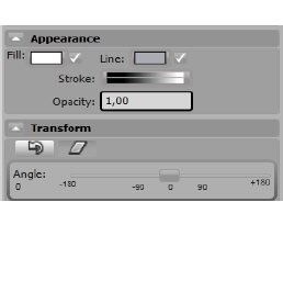 These settings can be made for controls on a screen. They define the appearance of a control and a way to rotate or distort.
Fill - When you click on the comic, a window of choice of the brush to fill the control appears, which includes colors, gradients and texture. If you prefer to use an image for the fill, in this window there is an Image button that allows you to choose images and their configuration.
Line - The same window, described above, appears for choosing the contour line of the control.
Stroke - Clicking on the figure, a window appears to choose the "Stroke", ie line format, full po, dotted, dashed, etc.
Opacity - Determines the opacity of the background of the control, a fractional number between 0 and 1.0 is transparent and 1 is opaque.
 The arrow defines control rotation. Choose the angle of rotation on the ruler below.
 The icon defines control distortion. Choose distortion angles on the X and Y axes of the screen plane
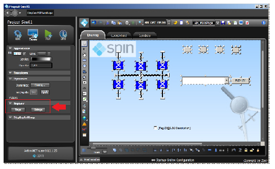
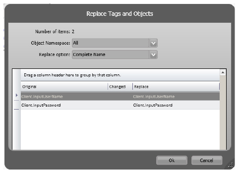
The Replace feature is offered when selecting multiple controls on a screen.
If you want to change a set of tags or texts on a screen, select all of them and use the Replace functionality as shown in the two figures below.
1. The following figure shows selection of several objects:
2. When you click on Tags, the tags used in these controls are shown. If we change the tags on the right, they will be superimposed on the screen by their left-hand counterparts.
3. In the case of texts, all Strings used in the selected objects will be presented in a similar way as above, to be changed.
Action.NET has powerful features to improve productivity in creating graphical interfaces in applications. Drawing tools allow you to easily manage symbols, image files, import objects from a gallery of 5,000 objects, and create your own symbols with dynamic properties and mapping between symbols and templates for their default representation in the interface print shop.
There are three main repositories of reusable components, the images, the Symbol Factory library, and the Local Symbols gallery. Better detailing each of these sources, then.
Images: Used to insert an external image file from your computer into project configuration, such as an icon, wallpaper, object or background image. You can manage imported images in Edit> Display> Resources. Once the image is imported, you no longer need the original file as it is embedded in the project file. Images can be used for any drawing object, even as "color" or for the colorfill dynamic attributes.
Symbol Factory: This is an extensive library of figures, with over 5000 symbols, all created using the vector graphics technique, which you can use to create your screens or use as templates to create your own custom symbols. These objects can be applied statically, such as an image or icon, or can be added to the dynamics and saved in the local symbol library.
Local Symbols: Local symbols are the most commonly used symbols, and include symbols created within a project. Symbols in this library can be kept synchronized with the library, so by changing a symbol in this library, this change is automatically applied to all screens that use the symbol. The local symbol can also have dynamic properties that can be easily mapped to Tags on screens; These symbols can also be defined as the standard graphical representation of Tags.
This section describes these possibilities and how to use them:
n Automatic linking between tags and symbols
You should import any images you want to use in your displays or reports through the Resources tab. This creates a repository of images for the application.
If you need to update an image with a new version, you can replace it, and it will be updated throughout the application. Be sure keep the resource name the same.
You can use any image file to fill or “paint” an object when creating displays from Draw > Drawing.
You can import the following file types:
n .bmp
n .gif
n .ico
n .jpg
n .png
n .tiff
n .wdp
To manage resources:
1. Go to Edit > Displays > Resources.
2. Click Import Images.
3. Navigate over file directories to where the images are that you want to import.
4. Select the image files and click Open.
5. In each row, enter or select information, as needed.
|
Column |
Description |
|---|---|
|
Name |
Edit the default name. |
|
Description |
Enter a description of this image. |
To add an image to a Display:
1. Go to the Draw environment and click the Insert Image Resource icon.
2. A new window will be open. Click the Import File button.
3. The new image will become the fill of a new rectangle. Fill in the rectangle object to change image settings. The image will also be included in the image library in the same way as explained in the previous item.
4. You can change from Stretch to None, Fill or UniformTofill. You can also view all objects that are in the project and change between them using the Select Resource button or just by clicking the image in the upper toolbar.
Typically UNIFORM or FILL should be used for stretching images. The image (using the Appearance menu on the left) can be applied to any graphically placed object placed on the screens.
The symbols library comes with a number of graphics you can use. You can also create symbols to add to the library. Symbols can be just a graphic or a graphic and dynamics.
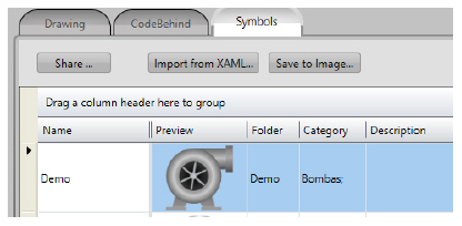
To view symbols:
1. Do one of the following:
n To see only the symbols used in this project, go to Draw > Symbols.
n To see all available symbols, go to Draw > Drawing, and click Open Symbol Library.
2. To save a symbol as an image file, select the row and click Save to Image.
You can use the drawing tools and commands for figures and draws conbination (union, intersection...) in the horizontal toolbar to draw your own symbols.
You can bring Symbol Factory symbols and click the Ungroup command on the horizontal toolbar to edit the parts or components of imported symbols. You can also use the Direct Selection cursor to edit internal elements without the need to ungroup.
To save the new symbol to the Local Symbols library, simply select the object or multiple objects you want to be part of the symbol, then right-click and select Make New Symbol.
To add a symbol to the library:
1. Go to Draw > Drawing.
2. Draw the object you want to become a symbol.
3. Select the whole object and right-click.
4. Select Make New Symbol.
5. Enter the name of the symbol and the folder (subdivision of the library) where you want the symbol to be saved.
6. From there, you can press the vertical bar icon in DRAW, to pick up symbols, and use them in any other screen.
Components in the Local Symbols library can have built-in dynamic properties and an easy way to map them to Tags at run time in the application.
If you have properties and dynamics for tags being used in this symbol, the system will automatically create the Symbol label parameters. After you make the new symbol, double-click it to check its configuration parameters.
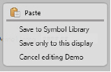
To edit a symbol that is already in the Local Symbols library, enter a symbol on a screen, right-click on the symbol, and select Edit Symbol, which will change the drawing tool, disabling the other elements, so that you can change the symbol without causing changes to other elements. When you have finished editing, right-click anywhere to select a menu where you can choose to save to library, save only to this display, or cancel edit.
 "Local symbols" objects are made up of a few standard symbols from the SymbolLibrary.tproj file, added with the product installation, and the symbols that you created for your specific project. If you change, delete, or insert a symbol in SymbolLibrary.Tproj, it will be accessible to all projects that are edited on this computer. The symbols you are using in your project are saved within the project file, thus completely independent of any external file.
Inserting symbols on a Display
To insert a Local Symbol on a Display:
1. Go to DRAW environment, right-click anywhere on the display and select Insert Symbol; Alternatively, you can click the Insert Symbol icon on the vertical toolbar.
2. A window appears with all the symbols available in the project. On the left side of the window a list with Folders (symbol groupings). On the right side are shown the symbols belonging to the selected Folder.
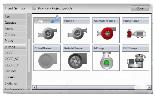
3. After selecting the Folder and the symbol, click on the symbol and then click on display to position the symbol, you can also drag and drop the symbols to the display. If you double-click a symbol, the library window is closed, allowing you to insert the selected object.
4. Double-click on the symbol to see its run-time properties and the tag map used by it. Each tag used has a Label, which can be used in the code behind to refer to the corresponding tag. See the Symbol Setup window in the figure below. In LevelValue (wich is named a Label) is the tag to be used.
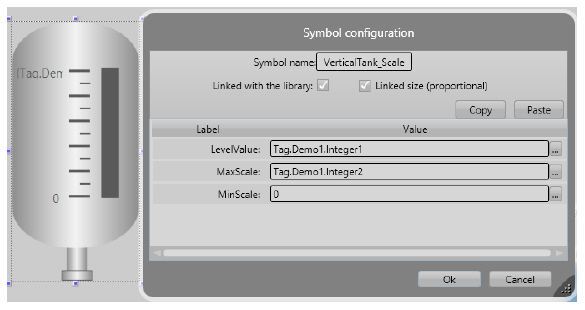
Some symbols have no custom parameters, in this case the double click will show the Dynamics window.
When you enter a symbol from the Local Symbols library, it may contain some parameters, as in the example above. In this case the parameters are LevelValue, MaxScale and MinScale. To change Tags linked to these parameters, simply edit the new tag names in the dialog box.
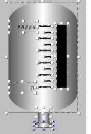 Right-click on the VerticalTank symbol and select Edit Symbol. In this way, you enter editing symbol mode: you can see all the objects that are part of the Vertical Tank, with dots and lnes limiting each one.
Click now on the black rectangle to see its Dynamics properties.
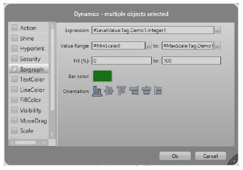
Note that the was used the syntrax:
#<PropertyName>:TagName
This syntax will create parameters for exposed labels, which makes it easier to map Labels linked to Tags when using the symbol. In these examples, the symbol has the labels "Level", "MinScale" and "MaxScale". When you enter this symbol, you can set values for these parameters. After the ":" character, you have the default value for the label.
Example:
#LevelValue: Client.SimulationAnalog, will be creating a property called "LevelValue", which has "Client.SimulationAnalog" as the default value.
You can use any name for the Label parameter.
When creating symbols, it is useful to initially map the properties to client.SimulationDigital, Client.SimulationAnalog, or Client.SimulationDouble, which are variables with values changing every second that allow you to show the result of their dynamic properties. You can use the built-in variables Client.DigitalValue, Client.NumericValue, and Client.TextValue, when you just want to put a placeholder value with no built-in simulation.
In order to save the symbol, right-click on the symbol or on Display and press Save for Symbol Library, or click the Save icon on the top toolbar. Double click on the symbol to check its properties.
The Symbol Factory library symbols are efficient and well designed vector graphics. If you need an object such as a pump, valve or most of the figures you need to use in your applications, simply open this library, navigate to the desired graphic, or search for object names.
The difference between the symbols of the Symbol Factory and the Local Symbols is that the first, after being included in a screen, become part of the same no longer having any connection to the library.They are just a drawing. In the case of Local Symbols these can maintain an active connection with the library and may also have dynamic properties.
To include a Symbol Factory symbol on a Display:
1. Go to the DRAW environment, then click the Symbol Factory icon on the vertical toolbar.

2. After clicking this icon, the Symbol Factory application opens;
3. To insert a symbol, simply choose a category and after the symbol. Then double click on the symbol and click anywhere on the screen.
Adding color animation to Symbol Factory elements
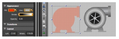
If you want insert animation by color changing without changing anything else in the symbol, you can copy the symbol and superimpose a transparent image over the image of the symbol.
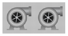
For example, two pumps are shown above. You can create a simple animation that shows when the pump is ON or OFF.
To insert animation ON OFF follow these steps:
1. First make a copy of the object, select the symbol and click Ctrl + D to duplicate it (you can also select the symbol, hold down the CTRL key and drag the object, or you can copy / paste).
2. Then select the second pump and click the Union button

on the horizontal toolbar.
3. With this new pump, locate the OPACITY property in the left panel, select a 0.2-0.5 opacity according to the desired visual effect, and select the initial brush color (red or green, for example).
4. Double-click the second pump and change the FillColor dynamic configuration.

Use the Client.SimulationDigital to simulate a change controller between 0 and 1. If you want to control the value yourself, use Client.DigitalValue or Client.NumericValue
5. Select the two pumps and click the Align Horizontal Center button and Align Vertical Center button.
6. If the pump with the opacity changes lies behind the other pump, click the Move Forward button to bring it to the front.
7. You can now click the View Preview button at the top of the toolbar to see the animation of the new pump.
Automatic linking between tags and symbols
You can set a symbol to be the default representation of a Tag type. This way, every time you paste a tag into the Draw environment, a symbol will automatically be created on the display corresponding to the Tag you entered.
Mapping between symbols and native types
The Native tag types Digital, Integer, Double, Decimal, Text, DateTime, and TimeSpan have a default view that is the name of the tag and an input / output text box. If you select one line or multiple lines in Edit> Tags> Objects (click a line, press Shift and click another line to mark a range), and right-click to copy those lines to the clipboard and paste on a display, the system will automatically create an object for each of these copied tags.
If you want to change the properties of the created objects, for example, change the dynamic of textIO "TwoWay" to "OutputOnly", select all text box objects (by clicking with the mouse on the screen, keeping it pressed, to select the area with the objects), and double-click on any selected object to open the Dynamics edit dialog, which in this case will show a "Multiple objects selected" window.
You can also copy the lines from Edit> Tags> Objects to Excel, add the Left and Top columns to the Excel table, then copy and paste this table, including the column heading, back to the screen; In this case, the system will position the objects found using the coordinates coming from the table.
If you create a symbol with the parameters of a Dynamic, and save it with the name of "Integer", this symbol will become the default for Integer tags. The same applies to any other type of tag.
Mapping a Symbol to a Type (Template)
In the same way that you can define symbols for Action.NET native default types, you can also define a symbol to be the default view of a user-defined type, that is, a Template. An object that has this template type will be represented on the screen by this symbol.
To map a symbol and a template:
1. Go to Edit> Tags> Templates to create a new template. In the following figure a template with the name Demo was created.
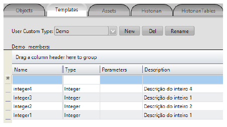
It has four members all integer tags.
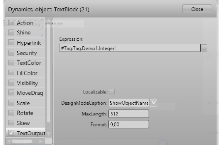
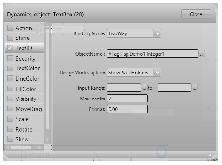
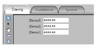
2. Back to the Draw environment, insert some objects that you want to be part of a symbol. In the example, a TextBlock and TextBox with the #Tag (Tag.Demo.Integer1) parameters are used in their dynamic properties
TextBox Dynamics:
3. Now select the TextBox and the TextBlock, and with the right mouse button choose in the Make New Symbol menu; Fill in the Name and Folder fields with the template name "Demo". The parentheses () in the expression of the TextBox and TextBlock, set the scope, over what should be overwritten when you map the symbol. The syntax #Label: (xxx) when you paste the Tags, it is the placeholder that will show where in the dynamic animations or expressions the tag name should be overwritten. Label is any name for the parameter.
4. Go to Edit> Tags and copy all tags with Type: Demo.
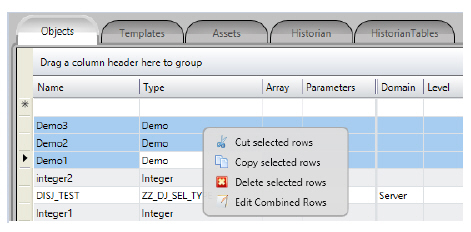
5. Go back to the DRAW environment and paste the tags on the screen.When inserting Tags of this type (template), the system will search for a Symbol object, with the same template name. If it is found in the symbol library, this symbol is created and linked to the tag that was pasted on display.
If you create symbols using only tag elements, not expressions, you do not explicitly need to use the complete syntax: #Label: (tag.Demo.Integer1) to set the parameters of the TextBox. If you only use the tag in the dynamic properties of objects and execute the Make Symbol command, the system will automatically look for tags in the symbol and create the related parameters. When using an expression, or when you have multiple tags and templates in the same symbol, you must explicitly use the # character and the parentheses in order to define the scope of your symbol's customizable parameters. When you want to use the Type as a parameter for the symbol, define within the dynamics of the symbol, always #Label: (tag.ObjectType). <Property>. Thus the parenthesis delimits the part that will be replaced.
Mapping Tags and Symbols Using Categories
When you want to map a symbol with a group of tags, but do not want to have this symbol map all Tags with the same type, you can use the Category column in the Tag definition to connect the symbols that should be used as the default for a group of Tags.
That is, only the Symbols with the same name as the Tags types, whose objects have the same categories, will be considered corresponding.
To use this feature, follow the example:
1. Go to Run> Dictionaries> Categories and create new categories.
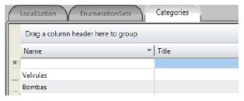
2. Go back to the DRAW environment and insert a symbol.
3. In this environment choose the Symbols tab and in the column category click and select the desired category for each symbol.
If the Category column is not visible, right-click any column name and then right-click, select the columns that you want to see.
4. Go to Edit> Tags to set the appropriate categories for each tag group.
5. Select all Tags, and make the copy, go to the DRAW and paste it on the screen. Note that only Tags that have the same category that was defined for the symbol will have their corresponding symbols created, although they all have the same type.
The namespace Display lists all displays with their properties and open and close methods.
The namespace Layout lists all layouts with their properties and open and close methods.
The namespace Client has the properties of the environment on each connected client computer or mobile device.
See http://www.spinengenharia.com.br/help/an-2016/runtime/index.html for the complete programming reference on runtime objects.
 Selection Tool
 Direct Selection Tool
 Hand Tool
 Rectangle
 Ellipse
 Polygon
 Polyline
 Button
 Text Output
 Text Box
 CheckBox
 Creates a radio button object.
 Creates a combo box.
 Creates a list box.
 Creates a password box.
 Creates a date picker.
 Creates a date/time text box.
 Creates a label box.
 Creates a slider control.
 Insert Symbol
  Symbol Factory
 Image Resource
 Web Browser
 Creates a Page Selector object, where users can go directly to a page in the application.
 Creates a Report Viewer object.
 Creates an XPS Viewer object.
 Creates a Circular Panel object. For more information, see
  Creates a Pie Chart object. For more information, see
  Creates a Bar Chart object. For more information, see
  Creates a Calculator object.
 Creates a Child Window object.
 Creates an external WPF component.
 Alarm Window
 Trend Window
 DataGrid Window


 HyperLink
  Bargraph
 MoveDrag